ProfitWell Metrics helps you make smart decisions that grow your business. Understand your results individually and against peers with powerful insights, presented in easy-to-use dashboards that track your MRR, churn, customer cohorts, and segment effectiveness.
ProfitWell Metrics is available to use anytime through Subscription Metrics on the live Paddle Billing dashboard — no additional setup required.
Track your key metrics with instant dashboards, reports, insights, and unit economics calculations.
Assess engagement and customer health data to reactivate customers and increase retention.
Build custom segments and compare trends over time for sharper insights.
Compare your business against industry peers with exclusive benchmark data.
Share via Slack, HubSpot, Intercom, and Salesforce to drive alignment and action.
See subscriptions, one-time charges, refunds, and fees together to strengthen revenue and reduce leakage.
How it works
Building a thriving subscription business requires more than just a great product and marketing strategy. Long-term growth requires continuous optimization based on customer and revenue metrics that most businesses either struggle to track effectively or don't have the tools, knowledge, or time to understand.
ProfitWell Metrics provides out-of-the-box analytics, translating your complex subscription data into actionable insights so you can make informed decisions with confidence and ease. No need to spend hours calculating which customers need attention, where growth opportunities exist, and which important metrics need improving.
Metrics
Key indicators of your business health are automatically calculated and presented as datapoints throughout dashboards.
Use these to understand customer costs, track lifecycle performance, optimize pricing strategies, and forecast revenue accurately.
- The monthly revenue from all active subscriptions.
- It's crucial for tracking growth and forecasting revenue.
- A higher MRR is usually better, except for annual plans where MRR is lower but the retention rate is higher.
- Paddle converts all subscription periods (monthly, quarterly, annual) into monthly values for easier comparison.
- When customers increase or decrease the value of their subscription.
- These metrics are vital for monitoring revenue retention.
- A higher upgrade rate, and lower downgrade rate, is better.
- Paddle still counts a customer switching to an annual plan as an upgrade, even if there may be less monthly revenue but more total value.
- When a customer stops using your subscription product.
- The higher the churn, the more money you must spend to acquire new customers and recoup the lost business.
- A lower churn rate is better.
- Paddle counts a customer as "churned" when their paid period ends instead of the moment they click cancel.
- When previously churned customers sign up again.
- Understanding reactivation helps identify what brings customers back and can reduce acquisition costs.
- A higher reactivation rate is better.
- Paddle counts returning customers separately from brand new customers.
- Your total MRR divided by total customer count.
- This metric helps inform pricing strategy and indicates the value customers place on your product.
- A higher ARPU is better.
- Paddle calculates this automatically to help benchmark against similar businesses.
- How much revenue a customer provides over the time they're subscribed to your product.
- It lets you know your growth potential and helps you plan your spending on acquisition.
- A higher LTV is better.
- Paddle calculates this based on how long customers typically stay and how much they spend on average.
Dashboards and reports
ProfitWell Metrics generates world-class dashboards and reports of your data every 3-6 hours so you always have the most up-to-date insights to take action on.
Use these to see what's happening with your business, understand why trends are occurring, and know exactly which levers to pull to improve performance.
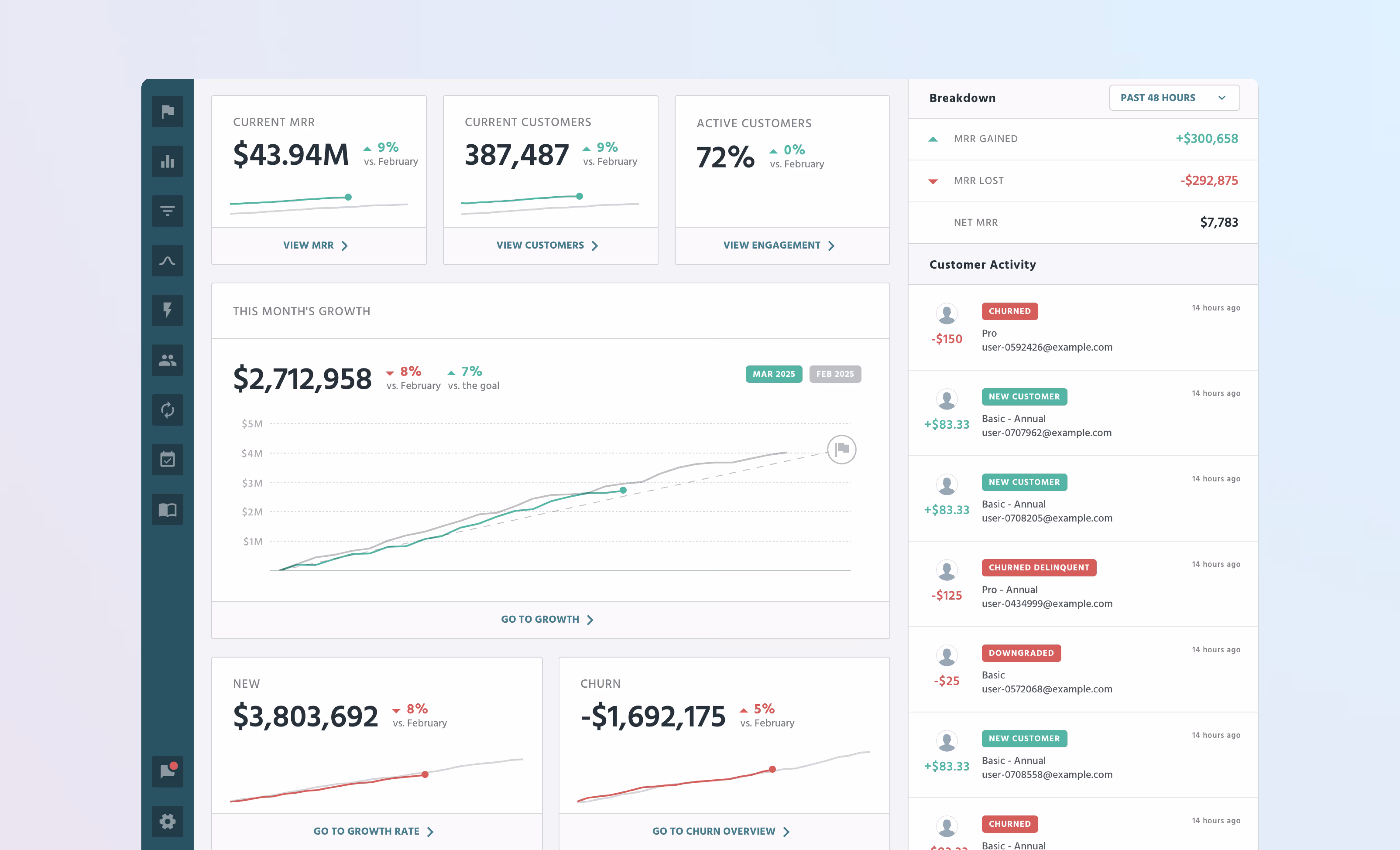
MRR overview
A high-level snapshot of your subscription data to understand your business health at a glance.
- Provides a holistic view of your company's standing on one page.
- Displays essential metrics, including MRR, customer numbers, ARPU, and LTV.
- Helps identify revenue trends and key subscription movements.
See a demo of the MRR overview dashboard
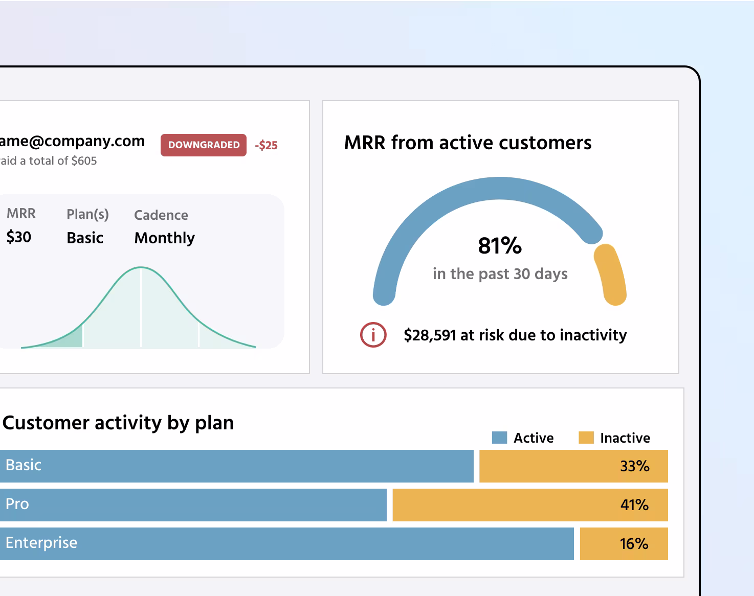
Customers and engagement
A detailed view of customer activity and revenue to understand performance on a granular level.
- Track customer counts by segment and identify the behavior and signals of those individuals.
- Combine with the Engagement view to understand where revenue is at risk from inactivity.
- Helps prevent churn and gain insight into which features drive long-term customer loyalty.
See a demo of the customers dashboard
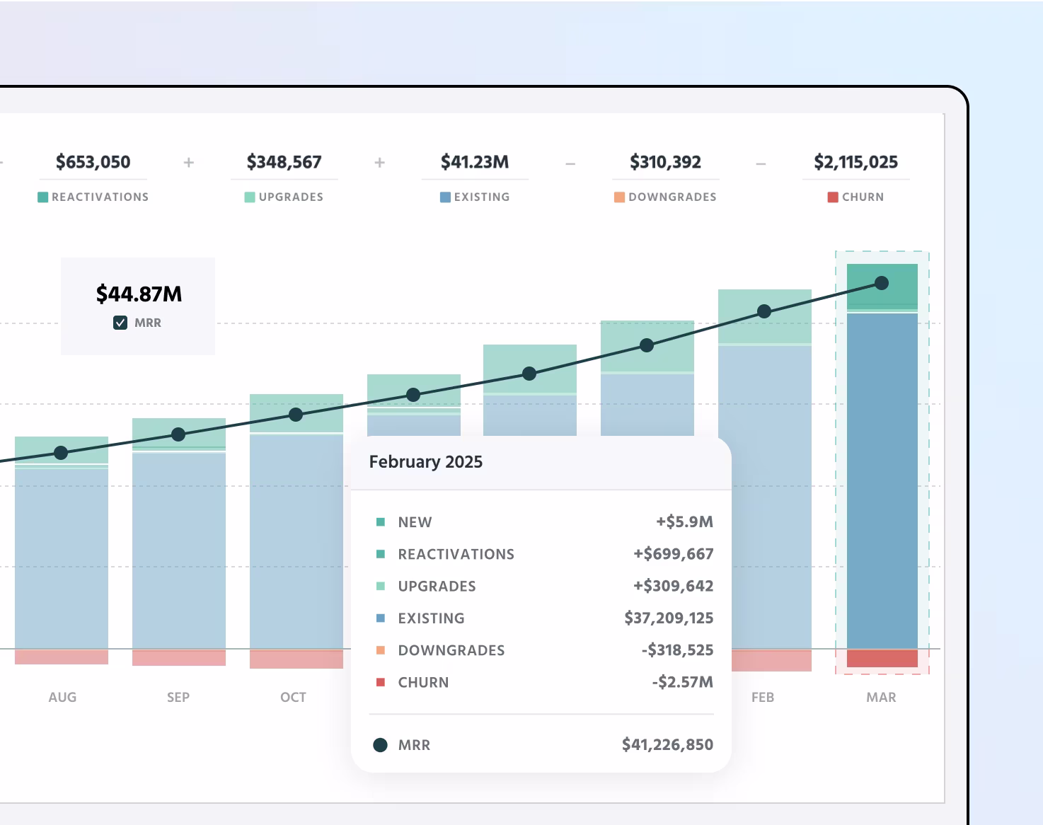
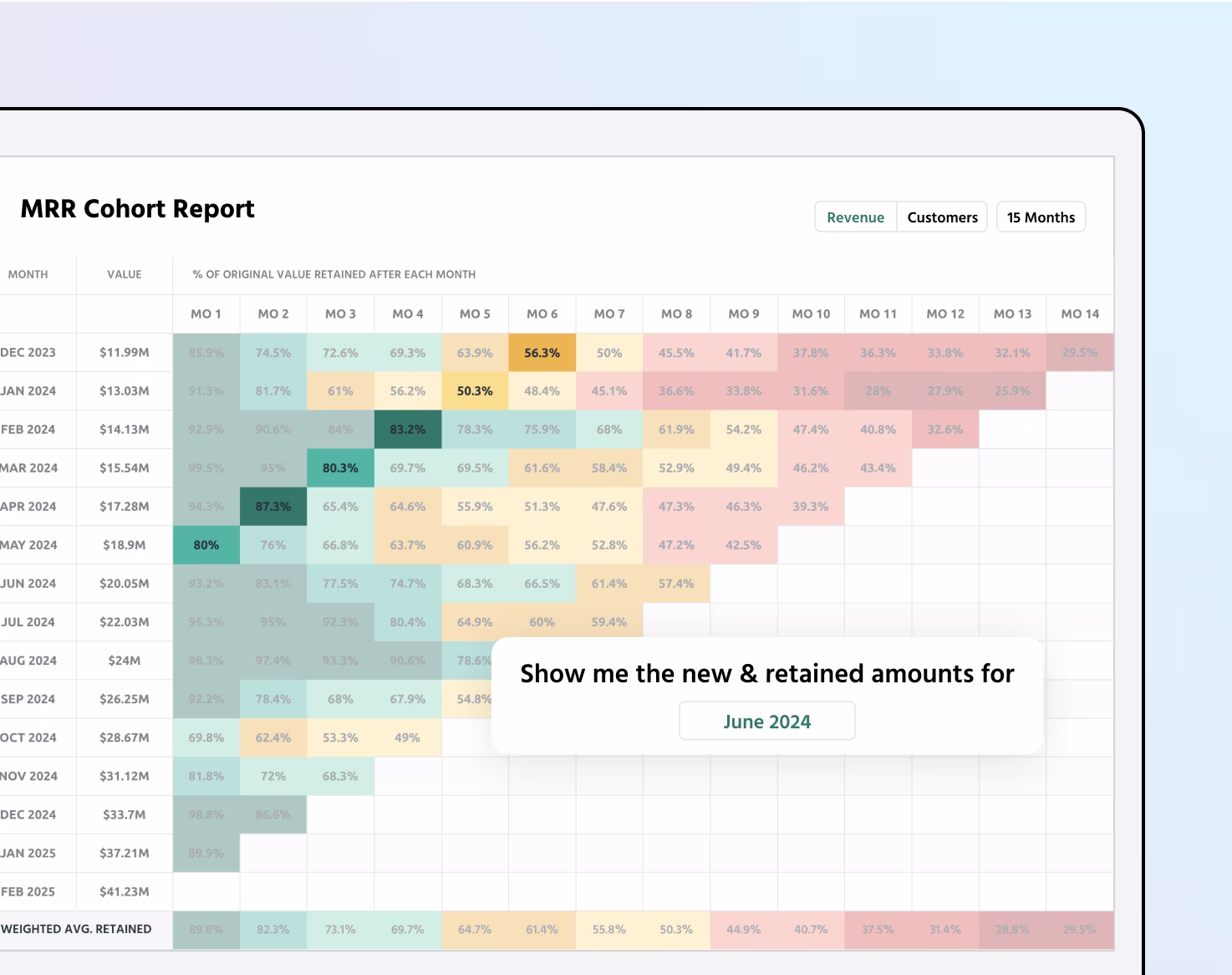
Cohorts report
Track MRR retention to understand how your business is evolving over time.
- Displays how much MRR has carried over into following months on a progressive basis.
- Track cohorts by signup month to measure long term retention and plan stickiness.
- Helps identify patterns in customer behavior and churn trends.
See a demo of the cohorts report
Segment comparison
Break down data into meaningful groups to drive insight and action.
- Compares metrics between preset segmented groups from auto-ingested data.
- Create custom segments using custom traits like account owner or campaign.
- Helps discover which customers deliver most value and uncover growth opportunities.
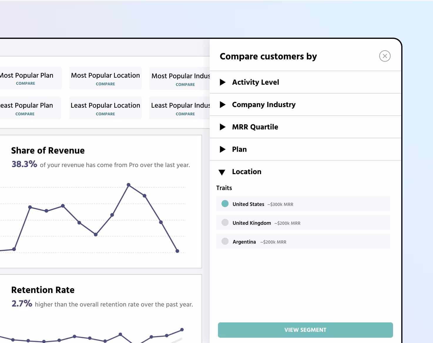
See a demo of the segment comparison insights
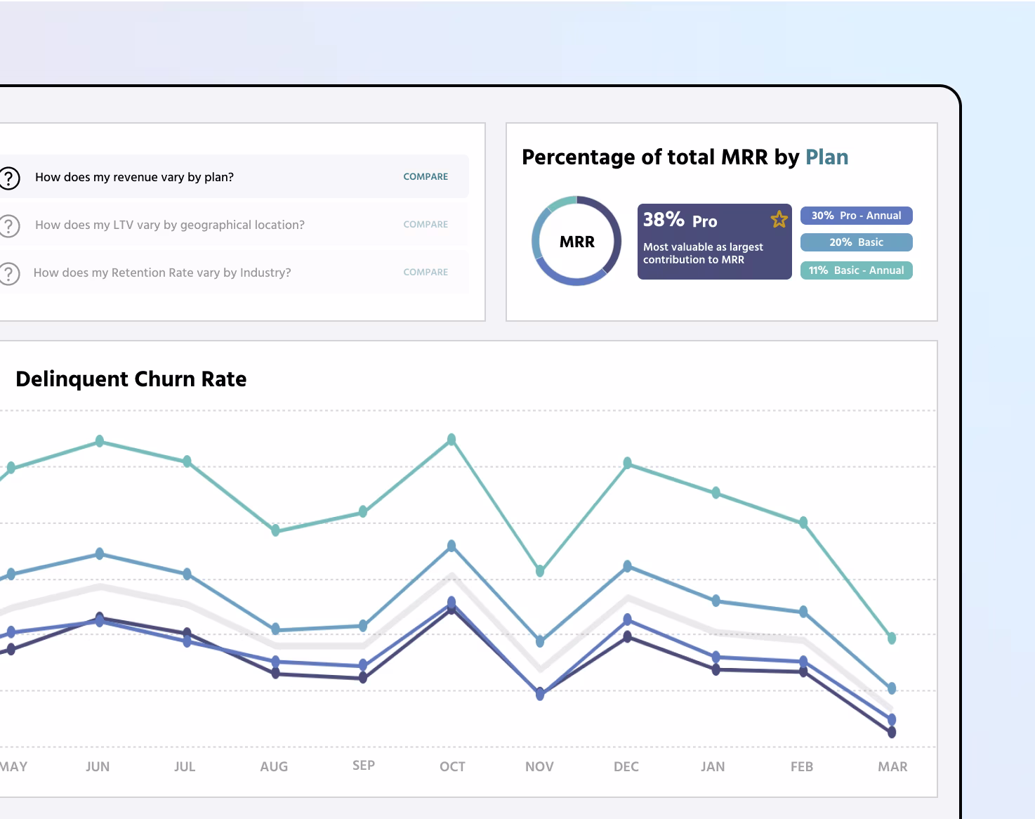
By plan breakdown
Compare up to five plans based on multiple metrics to optimize your pricing.
- Compare up to five plans to see which are delivering better results.
- Select different metrics such as MRR, total churn rate, and LTV to visualize plan effectiveness.
- Helps optimize pricing and packaging strategies based on actual usage data.
See a demo of the by plan breakdown report
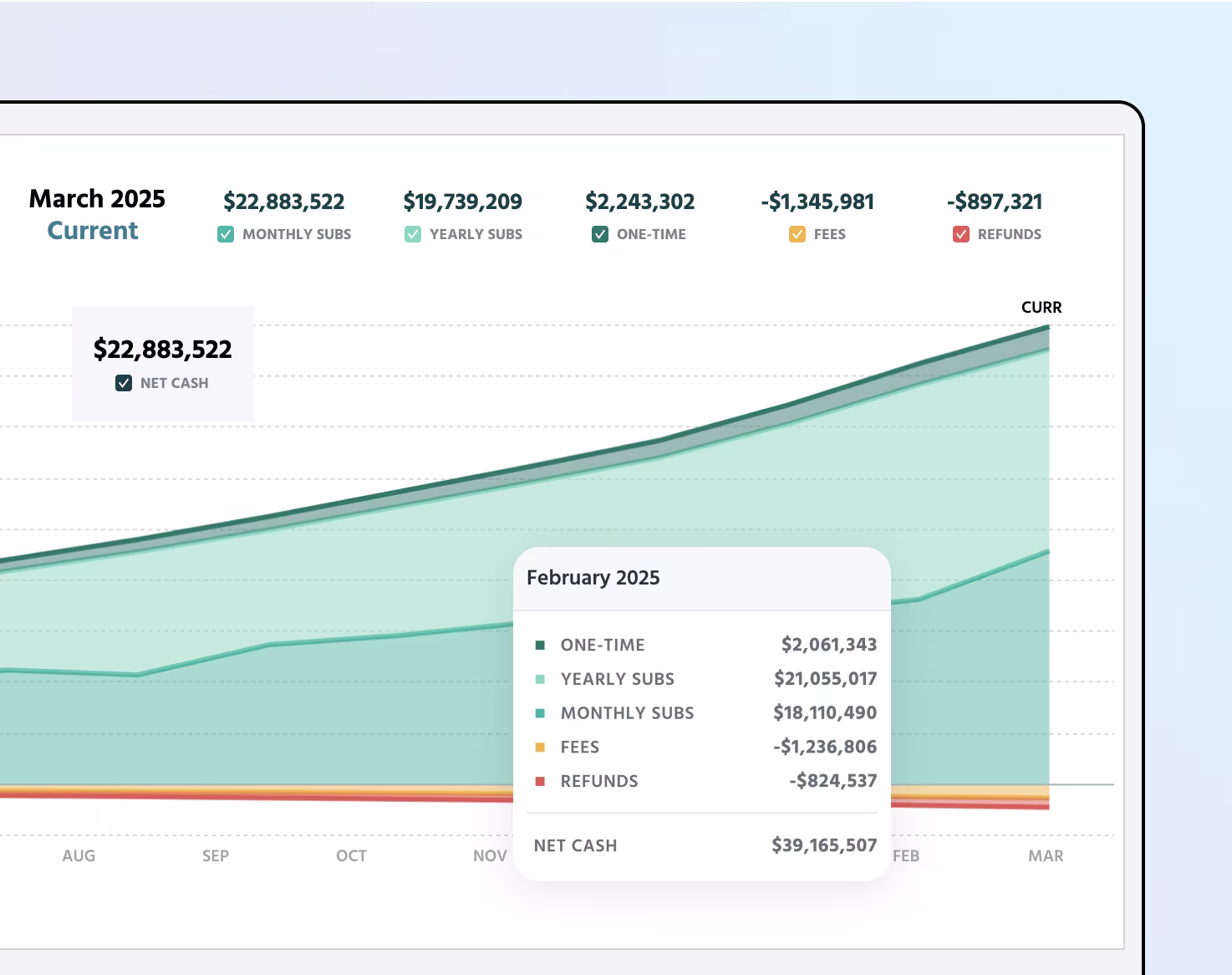
Cash flow
Track money flowing in and out of your business to strengthen revenue sources and reduce expenses.
- Registers subscriptions, one-time charges, refunds, and platform fees in one unified view.
- Filter by time to review financial data and export to share with your team.
- Helps identify opportunities to improve your revenue models and reduce cash leakage.
See a demo of the cash flow reports