Inline checkout comes with over 50 styling options to let you create a checkout experience that's fully integrated with your app.
You can change colors, borders, shadows, text, and other options directly from your Paddle dashboard — no engineering resource needed.
Go to Paddle > Checkout > Branded inline checkout to get started.
Attributes you can change
You can change:
- Checkout frame padding
- Font
- Text colors and sizes
- Border colors and widths, and how rounded borders are
- Hover states for buttons and links
- Focus states for buttons and links
- Positioning of labels for text boxes
- Checkbox colors
You can also change styles related to the checkout footer message. This unobtrusive message lets customers know that Paddle is the merchant of record for the transaction.
What good looks like
It's important that customers know who they're buying from, what they're buying, and how much they're paying.
To build an inline checkout that's compliant and optimized for conversion, your implementation must include:
- If recurring, how often it recurs and the total to pay on renewal. If a trial, how long the trial lasts.
- A description of what's being purchased.
- Transaction totals, including subtotal, total tax, and grand total. Be sure to include the currency too.
- The full inline checkout frame, including the checkout footer that has information about Paddle, our terms of sale, and our privacy policy.
- A link to your refund policy, if it differs from the Paddle.com standard refund policy.
Before you begin
You'll need to include Paddle.js on your page and pass a client-side token.
To open a checkout, you'll need to create products and prices and pass them to a checkout.
To get a step-by-step overview of how to build a complete checkout, including passing checkout settings and prefilling properties, see Build an overlay checkout or build an inline checkout
General
Font
The default font is Lato, a popular humanist font that fits into most designs. You can choose from a selection of system fonts instead.
If your chosen font can't be loaded on a customer device, Paddle falls back to Helvetica Neue, Helvetica, Arial, then the system default sans-serif.
Focus state
The focus state colors determine the border and shadow color when a field is selected. For text boxes, this means a customer has clicked into the field to enter their information.
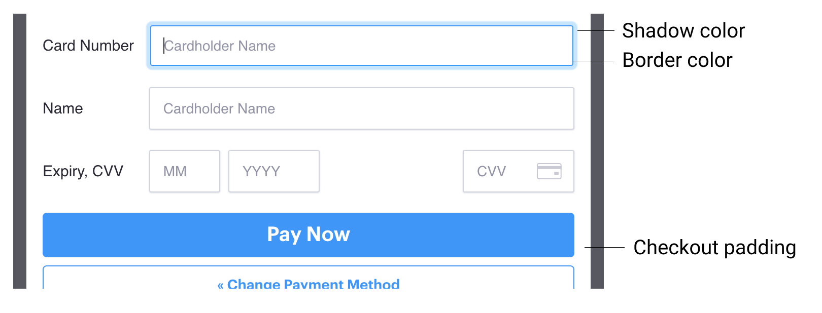
Checkout padding
Checkout padding is on by default. Turn it off to let your checkout fill the full width of the frame, which may be useful if you have your own padding set on your website.
Buttons
Some buttons are shown as part of checkout, for example:
- Pay Now
- Subscribe Now
- Pay by Card
- Change Payment Method
- Continue
- Cancel
Buttons are either primary or secondary:
- The primary button is the main thing you want a customer to do, like "Pay Now" or "Continue".
- Secondary buttons are for other actions, like "Change Payment Method".
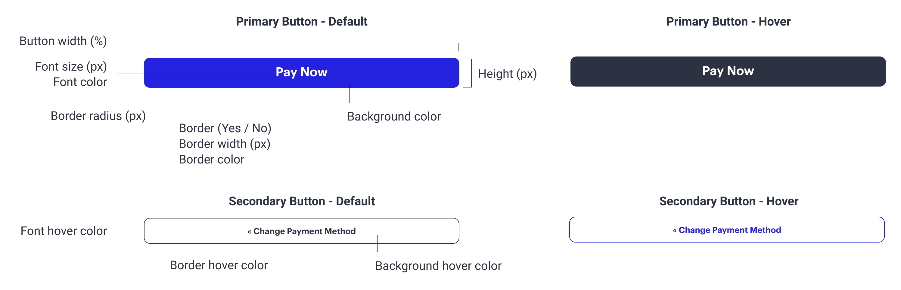
You can customize button size, text color, borders, and hover states using the options in the Button section.
We recommend that you make your primary button appear more prominent than your secondary button to guide customers through checkout.
Inputs
Inputs are fields where customers enter their details. This includes the labels (e.g. "Cardholder name") and input boxes themselves.
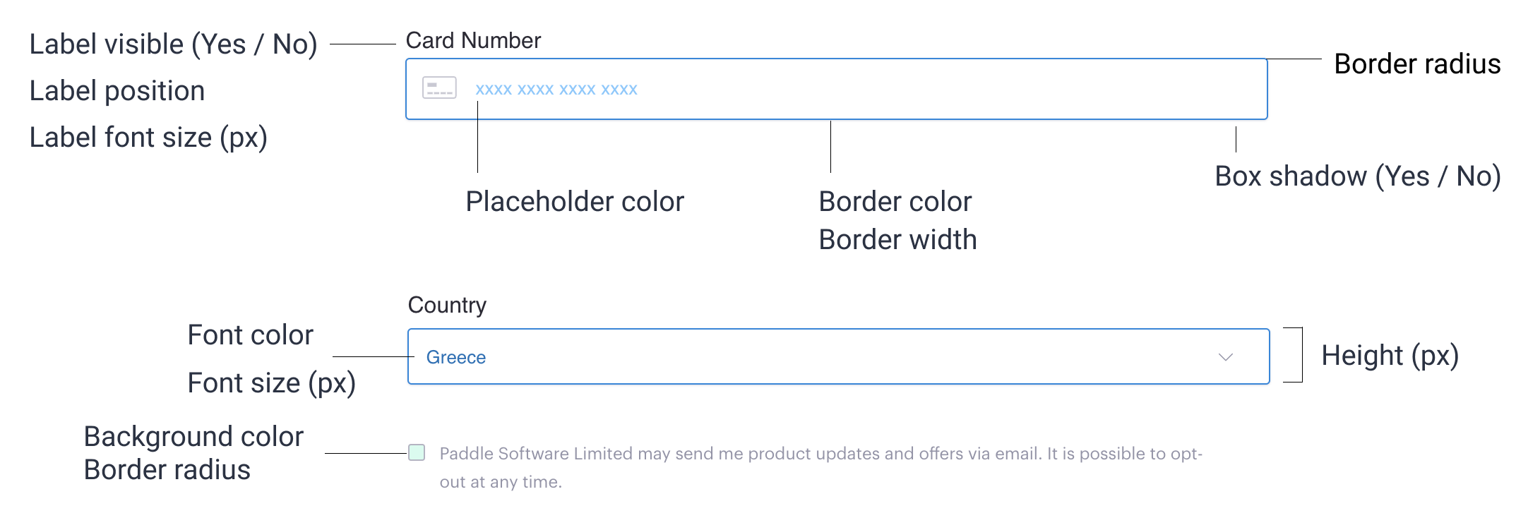
You can choose where labels appear relative to the field that they're describing, or turn them off altogether for a cleaner design. The placeholder fields in Paddle Checkout give customers an idea of what they should input in a field.
For compatibility, labels always show at the top-left of input fields on mobile devices.
Links
Some links are shown as part of checkout, for example:
- Add Coupon
- Add a VAT number
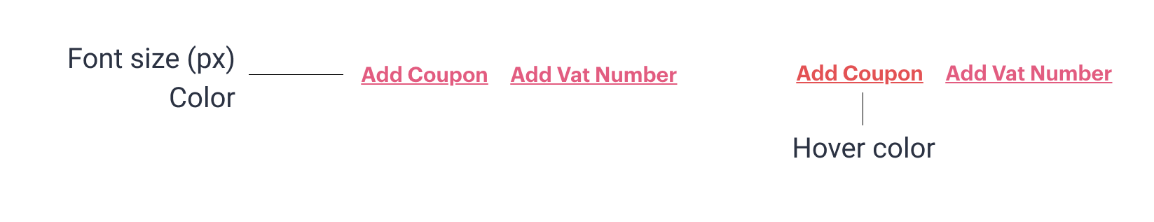
You can change the text size and color of these links. We recommend styling them so they stand out to against other text on your page.
Messages
Every checkout includes a message to let customers know that Paddle is the merchant of record for the transaction.
Checkout also shows a message to let customers know that a coupon was applied successfully.
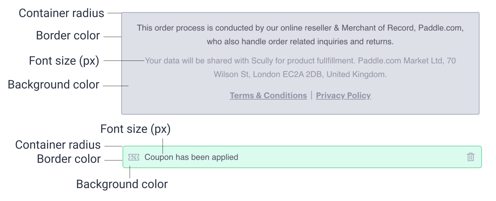
You can change the font size, border colors, background colors, and how rounded the containers are.
It's important that customers know who they're buying from. When customizing checkout, make sure the checkout footer message is visible and legible to remain legally compliant.